Issey in Blue
I haven't posted much in the past few weeks so I thought it would be fun to throw together a quick product shot.
Let's start with the product:

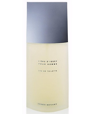
This is a bottle of Issey Miyake cologne. (image taken from www.macys.com)
Nothing really special about this shot. The bottle is well lit, and there is a small reflection, possibly done in photoshop after the fact.
Pretty easy to replicate if you have the lights to do so.
Here is one of my first test shots:

I didn't remove the horizon line or blow out the white background but I think you'd agree that for a test shot this is pretty close to the macy's one.
The first thing I wanted to do was to create a little mood in the photo. I did this in about 3 seconds by putting a blue gel over my main light:

So there you see we already have a pretty strong image. However, the top of the bottle is completely dark since it is lit from the back. This is a quick fix. By pointing a 2nd light with a grid (to limit the beam) at the lid, we solve the issue.

As you can see, the image is starting to come together.
Just out of personal preference I switched the side that the blue light was on and also positioned the bottle differently after this. At the same time, I decided I'd like the blue to be richer, which meant making the light not quite as bright.

The final touch is to make the background a bit more interesting. Right now it is just dark and isn't really working for me.
To liven things up a bit I added a 3rd light, with a blue gel and a grid and positioned it so that the light would fall across the background.
After some tweaking here is our final image:

Pretty nice image, and fore sure more interesting than the original image!
Let's start with the product:

This is a bottle of Issey Miyake cologne. (image taken from www.macys.com)
Nothing really special about this shot. The bottle is well lit, and there is a small reflection, possibly done in photoshop after the fact.
Pretty easy to replicate if you have the lights to do so.
Here is one of my first test shots:

I didn't remove the horizon line or blow out the white background but I think you'd agree that for a test shot this is pretty close to the macy's one.
The first thing I wanted to do was to create a little mood in the photo. I did this in about 3 seconds by putting a blue gel over my main light:

So there you see we already have a pretty strong image. However, the top of the bottle is completely dark since it is lit from the back. This is a quick fix. By pointing a 2nd light with a grid (to limit the beam) at the lid, we solve the issue.

As you can see, the image is starting to come together.
Just out of personal preference I switched the side that the blue light was on and also positioned the bottle differently after this. At the same time, I decided I'd like the blue to be richer, which meant making the light not quite as bright.

The final touch is to make the background a bit more interesting. Right now it is just dark and isn't really working for me.
To liven things up a bit I added a 3rd light, with a blue gel and a grid and positioned it so that the light would fall across the background.
After some tweaking here is our final image:

Pretty nice image, and fore sure more interesting than the original image!
Labels: blue. cologne, how to, issey miyake, lights

0 Comments:
Post a Comment
Subscribe to Post Comments [Atom]
<< Home